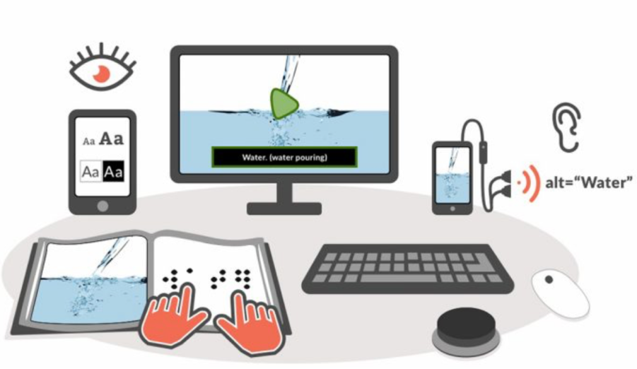
Most accessibility barriers in higher education are not caused by dramatic, one-off events. They are caused by small, repeated, easily fixed formatting choices, made without thinking, in the ordinary business of producing a slide deck or a reading list. This section sets out the specific, practical choices that make the biggest difference.
Documents
-
Use proper built-in heading styles — never bold text alone — so a screen reader can navigate the structure of the document rather than reading it as one undifferentiated block.
-
Use a plain sans-serif font (e.g. Arial, Verdana, Tahoma) at 12–14pt for body text; avoid underlining except for links, avoid excessive italics, and avoid setting whole words or headings in ALL CAPITALS, which is both harder to read and cannot be emphasised further if needed.
-
Use sufficient colour contrast between text and background, and never rely on colour alone to convey meaning — a red 'incorrect' label needs a second cue (an icon, the word 'incorrect' itself) for a colour-blind reader.
-
Add meaningful alt text to any image that carries information; purely decorative images can be left unlabelled so a screen reader does not waste a student's time announcing something with no informational content.
-
Use simple, clearly labelled tables with genuine header rows (not just bold text formatted to look like a header), and use descriptive link text — 'the university's accessibility policy', not 'click here' — since a screen reader user often navigates a page by jumping between links alone.
-
Avoid scanned, image-only documents entirely. A scanned page of text is, to a screen reader, indistinguishable from a photograph — completely unreadable, however good the print quality looks to a sighted reader. Export directly from the source document to PDF instead of scanning a printed page.
-
Provide an editable or alternative format on request — large print, audio, or Braille conversion — recognising that the more accessible the source document already is, the less time-consuming this conversion becomes; a badly formatted starting document can take hours to make usable, while a well-structured one converts in minutes.
Presentations
-
Keep slides uncluttered, with a limited amount of text per slide — a slide dense with text is hard to read for many students, not only those with a specific visual or attention-related difficulty.
-
Describe diagrams and images aloud rather than assuming they are self-explanatory, and avoid the habit of saying 'as you can see here' without further description.
-
Ensure content can be understood without relying only on colour — a chart distinguishing categories by colour alone excludes colour-blind readers and anyone accessing the content in black-and-white print.
-
Avoid flashing or rapidly changing content, which can trigger discomfort or, in rare cases, seizures for some viewers, and is disorienting for many others.
-
Share slides before the session, not only afterwards, so students who benefit from pre-reading vocabulary or structure — a theme that recurs across almost every chapter in Part 3 — have the chance to do so.
Video and audio
-
Provide accurate captions on all video content, and a written transcript where possible — captions that are auto-generated and unchecked frequently contain enough errors to genuinely obscure meaning, particularly for technical or discipline-specific vocabulary.
-
Ensure audio quality is clear, since poor audio compounds every other access barrier — a hard-of-hearing student managing marginal audio quality has far less capacity left over to process content.
-
Describe important visual information verbally within the recording itself, rather than assuming a viewer can see what is being shown on screen.
-
Avoid using uncaptioned media as essential, non-optional teaching content — if a video is the only source for a piece of required content, its inaccessibility becomes a barrier to the module itself, not just to that one resource.
Online teaching
-
Use consistent navigation and clearly labelled resources from week to week — a recurring theme throughout Part 3 is that inconsistent structure disproportionately affects students managing executive-function or anxiety-related difficulties, while genuinely costing sighted, neurotypical students very little.
-
Ensure keyboard accessibility, so that a student who cannot use a mouse (whether due to a motor impairment or because they are using a screen reader, which relies on keyboard navigation) can still complete every function on the page.
-
Provide accessible file formats for anything students are expected to download or interact with.
-
Record sessions where institutionally and pedagogically permitted, and explain participation expectations clearly at the start of a module, so students know in advance what live attendance genuinely requires versus what flexibility exists.
-
Provide an alternative where a specific platform creates an accessibility barrier for a student — for instance, where a particular tool is known to be incompatible with a specific screen reader.
Refer to WCAG 2.2 AA as an internationally recognised digital accessibility standard for anything published online, while checking whether local legal requirements in a given country add anything further to this baseline.
Sources: Accessible Academy platform guidance on document accessibility (font, colour, layout, writing style); W3C WCAG 2.2 AA and ATAG.
A quick before-you-send checklist
A short version of the guidance above, sized to run through in under two minutes before sharing any document, slide deck, or link with students.
|
☐ |
Does this document use built-in heading styles, not just bold text? |
|
☐ |
Is the font plain, sans-serif, and at least 12pt? |
|
☐ |
Have I checked colour contrast, and avoided colour as the only signal? |
|
☐ |
Does every meaningful image have alt text? |
|
☐ |
Is this a text-based document, not a scanned image? |
|
☐ |
If this is a video, does it have captions and, ideally, a transcript? |